Design and Web team summary – 26 August 2022
Anthony Dillon
on 30 August 2022
Tags: Design
The Web and design team at Canonical runs in two-week iterations building and maintaining all of the Canonical websites and product web interfaces. Here are some of the highlights of our completed work from this iteration.
Sites
The Web team develops and maintains most of Canonical’s sites like ubuntu.com, canonical.com and more.
Application page for Canonical career candidates
We are working on a system which gives candidates that have applied for positions at Canonical can see the status of their application as well as information on their current stage in the hiring process at Canonical.
This is an example of the hiring process outlined showing the stage the candidate is in and their past and upcoming interviews:

New pages on ubuntu.com
We’ve launched a bunch of new pages. A page to download Ubuntu for RISC-V boards, was released this iteration. Furthermore, Canonical has released the new Charmed Kubeflow beta 1.6, so we created a banner on the AI page and What is Kubeflow page, as well as the Charmed Kubeflow site to support it. We also started work on HPC (High-Performance Computing) pages, with a brand new contact us form. We thank all the product managers who participated in putting these pages together.
MAAS
The MAAS team develops the UI for the MAAS project.
Improving our testing process and getting ready for the React v18 upgrade
Most of our UI work in this iteration has been behind the scenes. The highlight task is migrating tests from Enzyme to React Testing Library and completing maintenance tasks. Migrating these tests will allow us to test our components in a much more user-centric and airtight way, and eventually allow us to upgrade to React v18.
Server-side machine search and filter
We’re in the process of implementing server-side search and filtering of machines in the MAAS dashboard. This will greatly improve the performance of the machine list when using MAAS with thousands of machines.
Previously, all machines were to be loaded by the browser client before the machine list could be interacted with and searching or filtering could be performed. We’ve re-architectured this so that a specific page of machines can be requested by the client and the searching and filtering is performed on the region controller before sending just the data needed back to the client.
MAAS Site Manager
As a company grows, the number of MAAS regions and data centres also expands simultaneously. In the last cycle, we’ve done an extensive research to understand the various ways that different companies are using MAAS, and this cycle we explored how our in-house team is using MAAS. We were able to categorise the usage into 3 categories.
- Using AWS as a Region controller
The first way our users set up MAAS aims to remove the need to manage Postgres themselves and create a semi-centralised MAAS setup by installing region controllers on AWS. In this example scenario, there are 4 MAAS instances distributed by 4 geographical locations in the world. So the MAAS instance acts as a PoP for all data centres and there are about 20-60 machines per data centre. In total, they are managing around 200-500 machines per PoP.
One of the biggest pain points here is Image Management, especially, custom images.
The current way to manage images requires you to upload the images to the region, then the images will get served to RDS. From here, there is a synchronisation process between MAAS and RDS, so all the rack controllers in the PoP will have to download all the images back from that database. Then when you go into the next PoP, you need to go through the exact same step.
There are 2 problems here:
1. Dealing with images is manual and redundant
2. There is a lot of traffic of the same data being stored multiple times in the Database
Database cost in the cloud is expensive
- The Telco use case
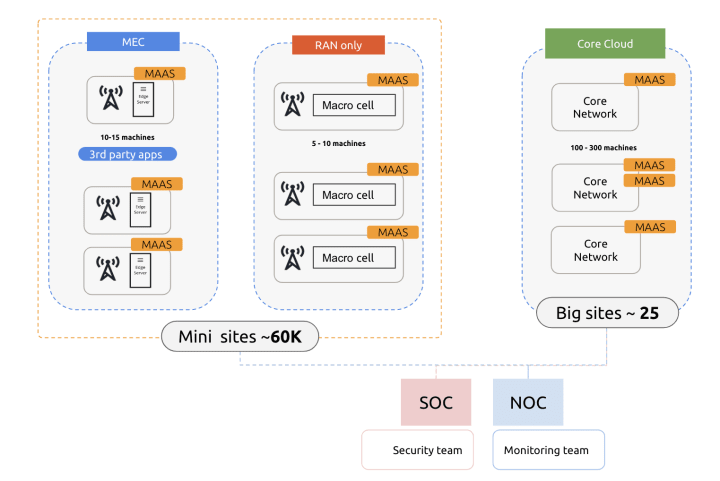
The Telco cloud use case is interesting because there are different purposes for Bare Metal that we have identified. The first part is the mini-sites called MEC and RAN, where they install cell towers to the base stations. There are between 5-15 machines per site and one site represents 1 MAAS instance. In the current setup above we can anticipate growing these mini-sites to around 60K sites all over the country. The second part is their core network, which they need to run their services. In the example setup, there are between 100-300 machines per Core site and one core site could be governed by 1 or 2 MAAS instances. Given that this is the scale, image management is still a problem, but instead of dealing with 4 MAAS instances, we’re talking about 25 core cloud sites + 60K mini-sites. Working images the current way is quite difficult.
Aside the image management, Telco users also really care about the operation, monitoring and troubleshooting guidelines as they have a very strict protocol for how to fix things and keeping everything in a state where it is well-maintained because if there is a power outage, it would be catastrophic if our phones don’t work.
So the important value here is they need to be able to plug any kind of manager to integrate with any systems like MAAS into their NOC.
- Using MAAS as a Region and Rack controller
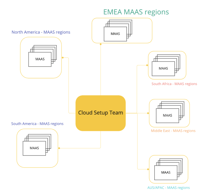
The last use case is our normal use case where they use MAAS as a Rack+region controller. One MAAS region represents 1 Data Centre. In some environments, a company may set up multiple MAAS instances to represent one data centre for different purposes. For instance, one data centre can have 3 MAAS region setups for user testing purposes, development testing purposes, and production. In addition, to make this a High Availability setup, we can also set 3 rack+region controllers for 1 MAAS.
Given what we have learned from this scenario, our current plan is to focus on three big features for this project. There are 3 phases of the MVP that are important for us. The first phase and our current focus is on region management and configuration. (As shown in the number badges below.)
Region management and configuration
Our earliest and roughest concept design focuses on how to display the right information for region overview. Assuming a user has multiple regions per country, the card below represents different locations in that country and the number of MAAS sites in that location. A user may manually configure the type of MAAS site that exists in that location. For instance, in the card below, there are 2 types of sites; micro-sites (3-10 machines per site) and core sites (25-100 machines for core computation).
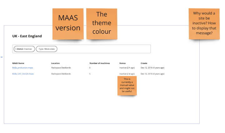
A user can then drill down into a specific location to find out information about a specific MAAS region. The image below shows mock information for inactive micro-sites that are located in East England.
Design system
The Vanilla team designs and maintains the design system and Vanilla framework library. They ensure a consistent style throughout web assets.
Improvements to Vanilla animations and transitions
Enhancing user interaction with subtle animations was the underlying theme of the front-end work in this iteration.
Well-implemented animations not only can make the UI more pleasant to look at but have the potential for enhancing accessibility. Unless an individual has difficulty handling motion in general, transitions can reduce the cognitive load – making it easier to track elements on the page and the relationship between them as they move.
We’ve added subtle expanding transitions to existing patterns including the Accordion, or new ones, like Expandable Side Navigation.

Accordion pattern with the applied transition on expand
All animations respect the CSS prefers-reduced-motion setting and therefore will be disabled if that’s the user’s preference.
Integration testing with Cypress
In order to make sure Vanilla components are tested not only based on visuals (that we already do use Percy), we introduced Cypress and started adding integration tests for our components.

Cypress with a passing accordion test using semantic queries
This will allow us to create tests that imitate the way real users would be interacting with the components.
Research-driven improvements to the upcoming main navigation on ubuntu.com
We’re working on an update to the main navigation on ubuntu.com. While user testing the new proposal, our UX research team discovered users take a couple of seconds to understand the hierarchy of the dropdown. We wanted to improve on this and make the 3 levels of navigation clearer (horizontal top-level menu items, followed by the vertical side navigation within the open dropdown, followed by the tiled content in the navigation’s main area). To do that, we slightly increase the prominence of the main area by making its background lighter.
Redesigning form and button elements
We’ve had long-standing complaints about text fields and buttons being a little too similar. There are slight differences – e.g. an inner shadow on text fields, and tiny rounded corners on buttons, but these are easy to miss due to their subtlety. To address that, we’ve come up with a proposal to bring text fields closer to the way they are styled in material design. In addition to making inputs and buttons noticeably different, the move from borders on all sides to a border at the bottom only makes large forms a lot less “noisy”. That allows us to increase the border contrast from the WCAG minimum of 3:1 to 4.5:1, making the border colour match the text colour.

Published UX specs
In this iteration, our Guest UX Designer worked and published UX specs for 3 Vanilla components – the matrix, buttons, and the slider.
Marketplace
The Marketplace team works closely with the Store, Snapcraft, Snapd and Desktop teams to develop and maintain the Snap Store and Charmhub.
Combine the Overview and Docs tabs in charm details
We used to have two distinguished tabs Overview and Docs in the charm detail pages.
The “Overview” tab in a charm detail page in Charhub.io contains some metadata (description from metadata.yamllinks). Its main content is populated by the Charm’s ReadMe file.
The “Docs” tab is populated by Discourse. Many charms have good documentation, but not here (mostly, in the ReadMe instead).
For the sake of consistency, while our backend team is working on unifying charm documentation/description within charms themselves, we came up with the first iteration of merging the Overview and Docs tab under a “Description” one.
For now, the content will be from the “readme” file. Later on, it will be consistent across all charms with a defined structure that will come from the charms when published.
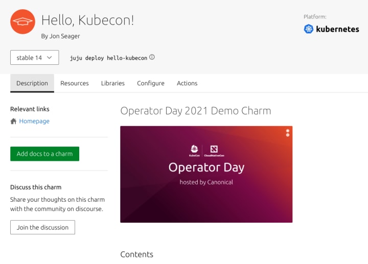
When there is no documentation, we provide a CTA to encourage publishers to provide discourse based documentation.
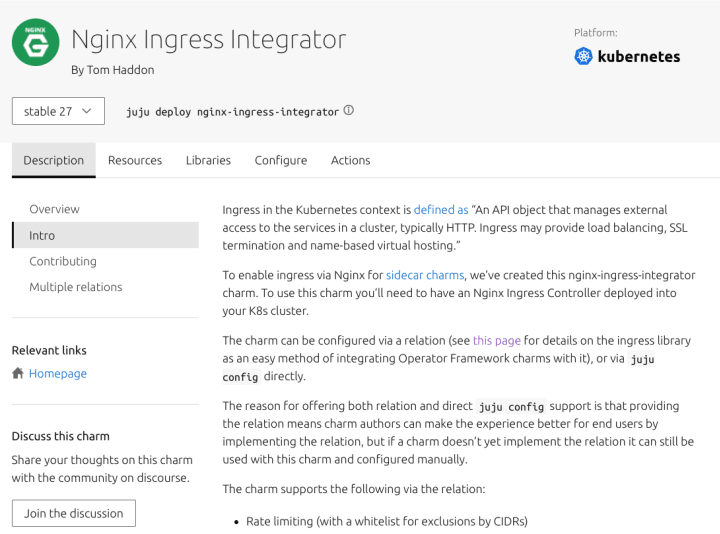
When there is discourse documentation, it is shown as side navigation, after the overview tab that contains the default “readme” file content.
It is also consistent across Bundle pages.
List of charms in a bundle details view
As part of the unifying work to improve the way we document charms, we applied the same merging of “Overview” and “Docs” tabs for Bundles.
On top of that, we are now showing the list of Charms that a Bundle contains.

Interface pages
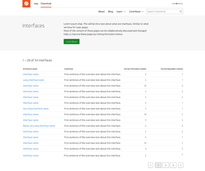
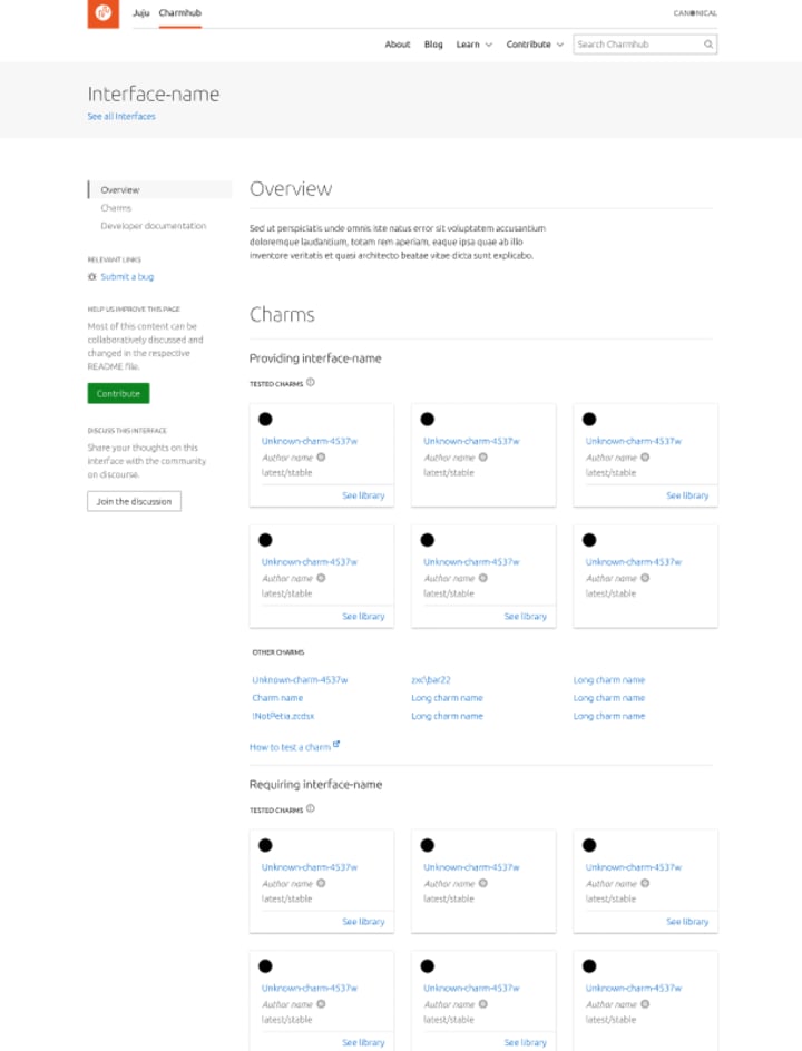
As part of the work that has been done recently, we have been working on the visual design for the interfaces pages. The next phase will be implementation.
User research
The User Research team works with design and product management to provide insights into our users’ needs and tools for teams to conduct their own research.
Iteration on the UA subscribe view
The UA subscribe view is where you can select and purchase your UA subscription from the website. We have tested the latest version of the design, giving our users challenges to complete by subscribing to the optimal plan for each scenario. We found that users generally found it seamless to navigate our new designs but needed more information to identify their desired products. With the UX team and product management, we will work on making sure users are presented with greater details of different coverage options and on limiting the possible combinations of security and support coverage to facilitate choosing the optimal plan.
Team posts:
- How to Get Your First Job in UX: A Guide by Will Grant
- Balancing innovation in software engineering teamsby Peter Makowski
- Quick thanks by Anthony Dillon
We are hiring!
Come and join the team. If you would like to find out more about the team please read our blog and description of the team.
With ♥ from Canonical web team.
Talk to us today
Interested in running Ubuntu in your organisation?
Newsletter signup
Related posts
From inspiration to impact: design students from Regent’s University London explore open design for their dissertation projects
Last year, we had the opportunity to speak at Regent’s UX Conference (Regent’s University London’s conference to showcase UX work by staff, students, and...
Showcasing open design in action: Loughborough University design students explore open source projects
Last year, we collaborated with two design student teams from Loughborough University in the UK. These students were challenged to work on open source project...
Design and Documentation clinics at FOSDEM Fringe 2026
FOSDEM is one of the biggest and most exciting open source events of the year, held at the Solbosch campus of the Université Libre de Bruxelles (Brussels),...
