Hebrew and Arabic on track
Canonical
on 4 January 2011
Tags: Arabic , Dalton Maag , Design , font , Hebrew , typography , Ubuntu Desktop
Although I haven’t posted much recently we have still been working away. Besides the latest update to Version 0.7 of the core fonts, which posed some technical challenges, we have now finalised the Hebrew Regular and are making good tracks with the Arabic.
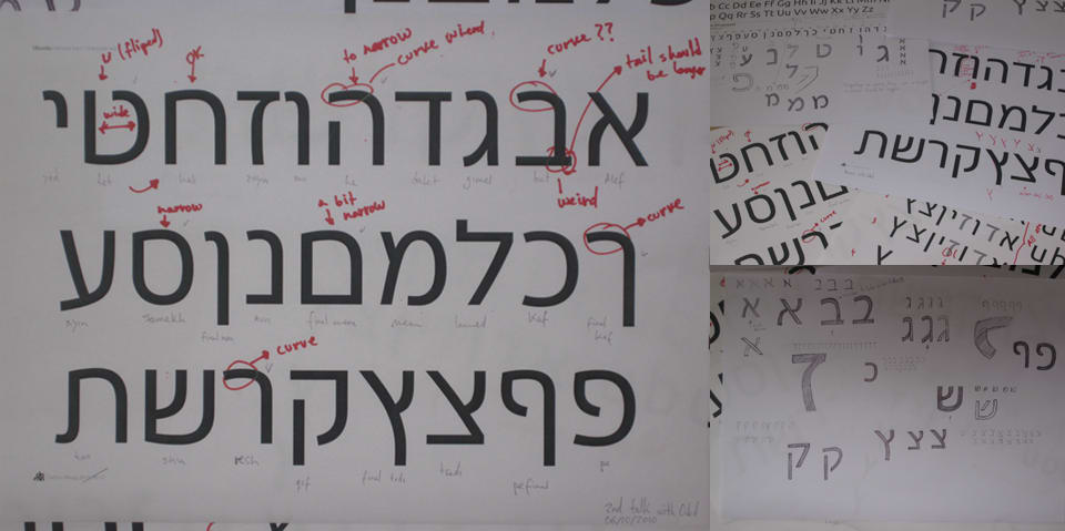
You may remember the earlier post on the subject of the Hebrew where we pondered the height of the Hebrew letters in relation to the Latin. Initially, we favoured a smaller Hebrew design that was more akin to small caps but we then found, upon further reflection, that this was wrong. Eventually, we decided on a height that is just short of the Latin caps. These proportions now sit very comfortably with the Latin and, more importantly, the Hebrew feels right on its own accord. Pilar Cano, one of the designers in the Dalton Maag team, worked closely with a native Hebrew speaking typographer to ensure that the letters have coherence, are legible and maintain the clean and modern expression that is Ubuntu.
The Hebrew Regular is now completed and Pilar is proceeding with designing the Italic style. Some studies suggest that if the Italic is leaning in the same direction as the Latin it should be a simple slanted. We will, however, inject some cursive elements into the Italic to maintain stylistic coherence with the Latin.
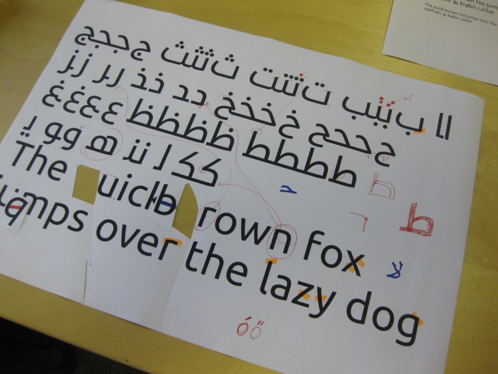
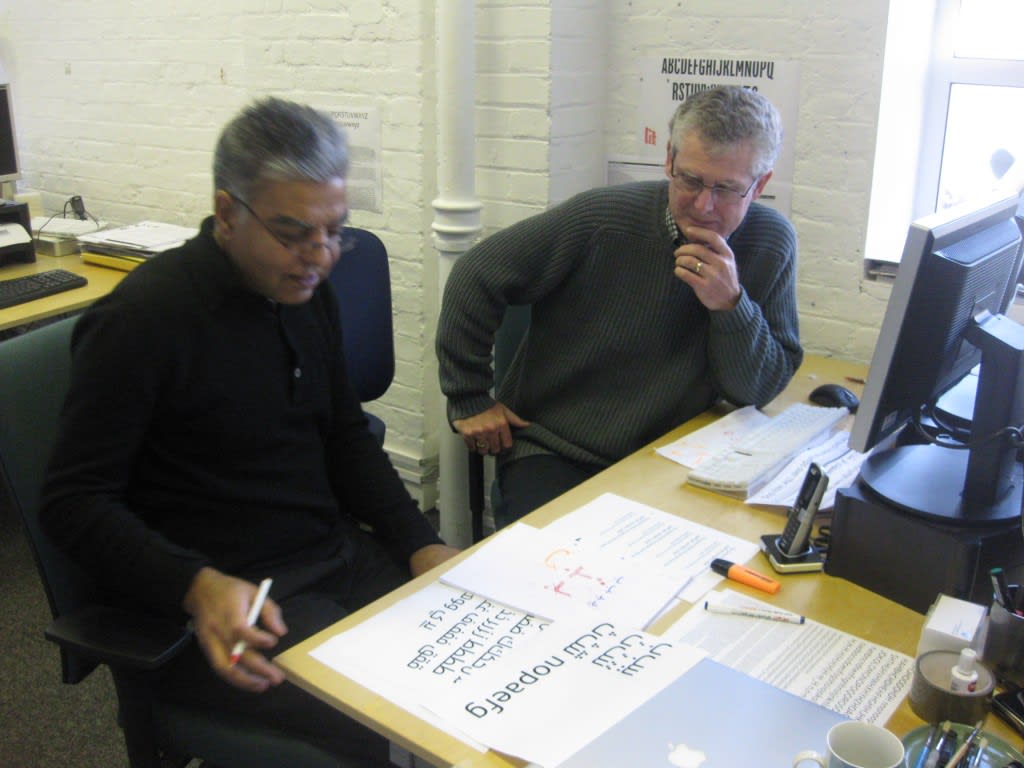
The last two months we have also worked on the Arabic design. As with many complex and exotic scripts the challenge is to translate the look and feel of the Latin to the non-Latin script. Our design team, lead by Ron Carpenter, developed a wide range of initial concept trials to define the design features and texture of the Arabic and presented these to our consultant Prof Rayan Abdullah. Together we discussed and refined the trials until we arrived at the design that we are now all happy with: a primarily Kufic design that is tempered with some Naskh elements to make it suitable for text size reading. The strong Kufic influence makes this font particularly suitable for short entries in UI design for future Ubuntu Arabic localisations.
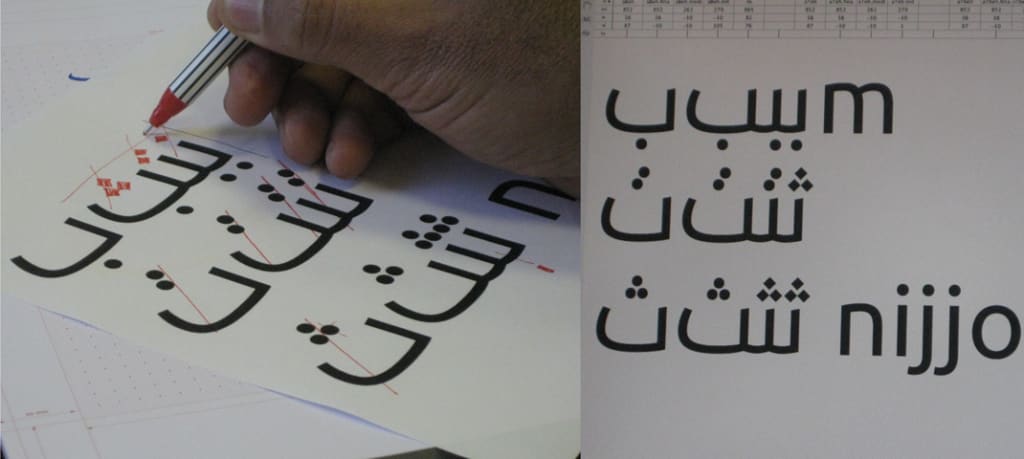
As with the Latin, the Arabic runs slightly more narrow that one would normally expect, to facilitate the use in UI. This presents a challenge in regards to the dot positioning above and below base characters. The dots are crucial to clearly identify the character, and a misinterpretation can easily lead to a word having a completely different meaning. We have placed the double dot on a diagonal line which allows for two double-dot characters to be set next to each other without causing any interpretation, aesthetic or legibility issues. A further feature of the Arabic design is that the baseline has a soft, rounded appearance, as is the case with the x-height and in some cases the cap height in the Latin. This, combined with the overall texture creates a tight harmony between the two scripts.
As Italics as such do not exist in Arabic we will simply add the standard Regular and Bold versions to the Ubuntu Italic and Bold Italic fonts ensuring that all fonts have identical charactersets. We are working hard to complete all the design and engineering work for these fonts for the next big Ubuntu release in the coming Spring.

An enterprise Linux for everyone
Ubuntu powers millions of PCs and laptops around the world.
Ubuntu brings security, usability and stability together, offering you a platform for innovation, combined with the freedom that transparent, open source code offers.

Bring Ubuntu to your organization
Ubuntu Desktop combines enterprise-grade support, security and functionality with the best of open source.
Seamlessly integrate Ubuntu machines with your existing infrastructure and tools.
Newsletter signup
Related posts
Supporting more identity providers on Ubuntu with the new Authd OIDC broker
Today we are announcing the general availability of the new generic OpenID Connect (OIDC) broker for Authd. With enterprises needing to centralise access...
Unmasking the Resolute Raccoon
You’ve almost certainly seen them… In the forest, rummaging through a dumpster, in poorly aging millennial memes. Raccoons are ubiquitous and endlessly...
From inspiration to impact: design students from Regent’s University London explore open design for their dissertation projects
Last year, we had the opportunity to speak at Regent’s UX Conference (Regent’s University London’s conference to showcase UX work by staff, students, and...


